Showing posts with label Analytics. Show all posts
Thursday, January 28, 2016
Wednesday, January 27, 2016
Sunday, March 1, 2015
Customer Complaints - Infographic
Total Number of customer Complaints:

First level of drill down (To be expanded as you click on respective blocks)

Second level of drill down (To be expanded as you click on respective blocks)

You can add multiple levels of drill down depending on the categories drill down and the extent of analysis ./ visualization required.
First level of drill down (To be expanded as you click on respective blocks)
Second level of drill down (To be expanded as you click on respective blocks)
You can add multiple levels of drill down depending on the categories drill down and the extent of analysis ./ visualization required.
Saturday, February 28, 2015
Monday, August 4, 2014
Heat Map - Visual Representation
Heat
map is one of the useful and powerful data-analysis tools available in
business intelligence. Heat Map is visual representation of data using
colors instead of numbers only. This tool is used to analyze the complex data
sets for a quick and easy way of understanding.
Popular heat maps being referred/used in the
industry includes
- Election results by geography
- Visitors interaction with a webpage
- Usability or consumer experience
There are many
ways to create heat maps but the common understanding in all of these
representation is usage of colors to communicate the numbers and their
relationships. Heat Maps are mostly used for two
dimensional representation. But the advanced heat maps can be drawn for more
than two dimensions. For example cell size and color both can be used to
represent a different relationships. One can add sliders to filter/zoom the
data and its relationships as required by the user. If you have to represent the
same situation using a bar chart, the visual would be cluttered and difficult
to understand.
Example:
Below heat map
used to understand the customer feedback from a service operations. Customer provided
his feedback with the services offered by the vendor. Feedback can be positive
(Happy with the service provided) or negative (Not happy with the services). Purpose
of this heat map is to understand the customer view of the services provided
with appropriate filters and drill-downs.
Tuesday, June 24, 2014
Analytics – Lead Time Prediction
Below approach can be used to
predict the lead time of completing a project considering the variation and
cycle time distribution from the past data. The results are interpreted
considering the probability of interest.
Steps to predict the Lead Time:
- Collect the data from past related to cycle time and data may include the sub divisions i.e., cycle time may include the actual cycle time, hold time, cycle time of multiple steps etc.,
o
E.g., Project of setting up a new server may
include purchase, installation steps. While gathering the data we can collect
the data at the desired level to capture the uncertainty in each steps while
predicting.
- Understand the distribution of the data
- Calculate the Lead cycle time for multiple probabilities considering the distribution data is following. For this example we are considering that the data is following Normal Distribution. We can use Excel Function NORM.INV (probability, mean, standard_dev) to calculate the Lead time (Predicted) for the project considering different probabilities
- Another way of predicting the lead cycle time is through simulation. Assuming normal distribution generate the normal variables
o
Cycle Time : Mean (31) and Standard deviation (17)
o
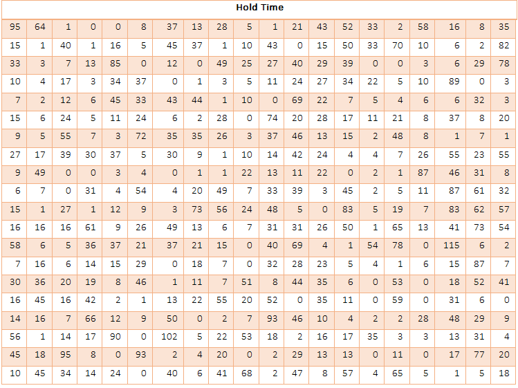
Hold Time : Mean (23) and Standard deviation
(24)
o
Add up to get the Total Cycle time = Cycle Time
+ Hold Time
- From this you can interpret that 90% probability cycle time = 103 days
- Probability to complete the project in 60 days = 55%
Subscribe to:
Posts (Atom)